Wk 10 VIDEO Link
As we all have been spending much more time at home, you may have also spent a little more time organizing your living space.
As we all have been spending much more time at home, you may have also spent a little more time organizing your living space.
Maybe you were asked by your parents to pick up your room. You may have seen your parents or older siblings take some time to organize their SPACE at home. Maybe they began a project in the yard, painted a bedroom or set up a work desk for homework.
Artists also choose different WAYS TO ORGANIZE their ART, to keep our eyes looking at it!
These different “ways to organize” are called the PRINCIPLES OF COMPOSITION (PDF list to print).
By now, you are familiar with the Elements of Art (line, color, shape, form, value, space, and texture).
Balance
Emphasis
Movement
Pattern
Repetition
Proportion
Rhythm
Variety
Unity
- I don’t expect for you to remember all of these Principles of Composition right now. But, by middle school….yes. :)
YOUR SUMMER CHALLENGE is to choose just ONE Principle of Composition from the list above and to be on the lookout for it wherever you might see it in action, in nature, in buildings, in signs, in your garden..... ANYWHERE......
This is only a looking challenge. There is no need to draw or turn anything in. However, I would still love to see some pics of what you discover!
HERE is a VIDEO of me showing you some painting examples of the Principles of Composition....and some pottery at the end as well.
AND YES…...YOU KINDERGARTENERS CAN DO THIS TOO!!!. EVERYONE IN THE FAMILY CAN HELP LOOK WITH YOU.
As a family, you can learn how everyone may see or notice something different.
In class, YOU see things that I don’t notice, ALL THE TIME! We ALL help each other to see more clearly, the world around us.
Below are much more detailed explanations of the Principles of Design in art.
Remember parents, only choose ONE! I'm not asking your family to remember the entire list.
In symmetrical balance, if you could fold a picture or sculpture in half so that the end match up, it could be thought of as having bi-lateral balance like a mirror image. A classic example of this is Leonardo Da Vinci's Last Supper (1498).
At home, if your family all sit evenly spaced apart, around and across from one another, you could create symmetry in the way you are seated.
In asymmetrical composition, elements are are different enough from each other to create a visually unstable balance. In Hokusai’s The Great Wave (1833) the visual balance is dramatized by the very large wave compared to the other smaller waves.

Take a bath and make some waves!
In radial balance, the elements are arranged around a central point of focus and move towards the outer edge of the composition. It offers a visual stability and commands attention from the viewer. The Buddhist Monk Sand Mandala (2005) at the San Antonio Museum of Art is a great example of Radial balance.
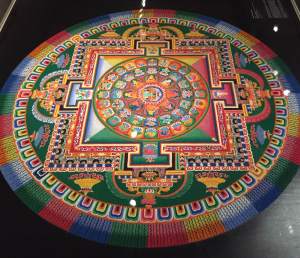
Go outside, find a stick, grab the hose to wet down the soil and draw a radial design in the mud. OR, go for a bike ride....HINT: look at the spokes on your wheels!
2. Emphasis:
When an artist composes a work of art, sometimes the artist directs our eyes to one area of the painting more than the rest. Rembrandt van Rihn's Self-Portrait in the National Gallery of Art, Washington D.C. (1659), directs our eyes immediately to his face in the soft light. Everything else is in shadow. Emphasis makes one area STAND OUT from the rest through color, value, texture, size, shape, etc.
This particular area becomes the main "emphasis."
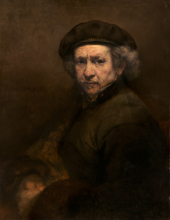
Take a picture of a family member (pets included) with some morning or evening light softly resting on their face.
3. Movement:
When an artist wants to create a path for our eyes to travel in a work of art, they use the design principle movement. Movement controls the elements in a work of art so the eye is led from one area to the other. Movement is generally created by the placement of shapes. In Thomas Hart Benton’s Wreck of Old 97 we imagine the movement of the horse and train. Our eyes follow the storyline from the dirt road to the intersection of the train. Yikes!


Find a few toy cars or wagons to re-create the movement that you see in this painting. Careful!!!
4. Pattern:
Pattern is the organization of one or more elements of art i.e. line, shape, colors etc. over and over again in a work of art. In the The Book of Kells, you can see patterns created with knots.
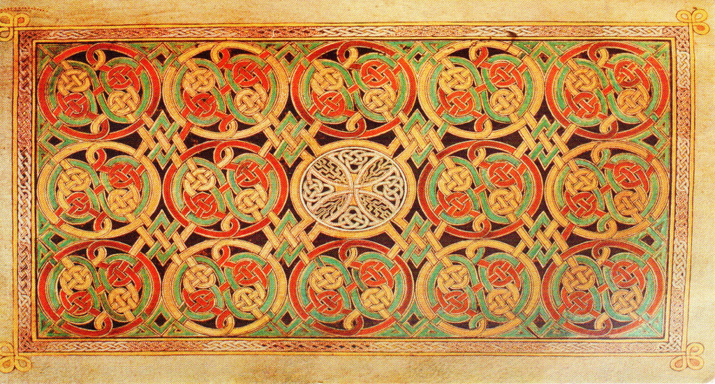
Find some pebbles, sticks and leaves outside. Draw a shape in the dirt with a stick or a piece of chalk on the sidewalk. Can you create a pattern using only the pebbles, sticks and leaves?
5. Repetition:
The artist Andy Goldsworthy methodically arranges cherry leaves to create a line by connecting leaf after leaf......changing colors gradually along the way.

6. Proportion:
Proportion is about comparing the size (or scale) of one thing, or part of a thing to the size of something else. We often don't even think of "proportion" when looking at objects around us. However, we probably would notice when something was OUT OF PROPORTION.
For example, if your head was as big as a watermelon....then your head would be WAY out of proportion compared to the rest of your body!!!
The artist Leonardo Da Vinci studied the human proportions meticulously (a lot! Very very carefully).
(The swimmer Michael Phelps has super long arms....longer IN PROPORTION to the height of his body-but that is why he can swim faster than you and I !)
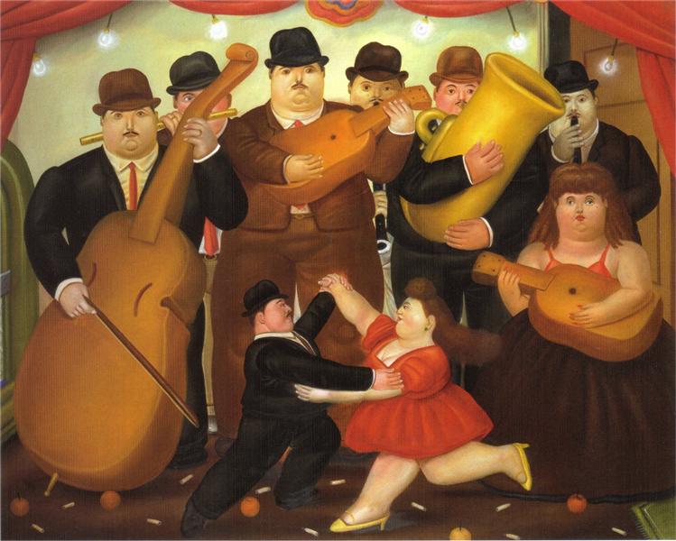
Do you think that the things in this painting, called Dance in Colombia, by Fernando Botero, are IN or OUT of proportion???
7. Rhythm:
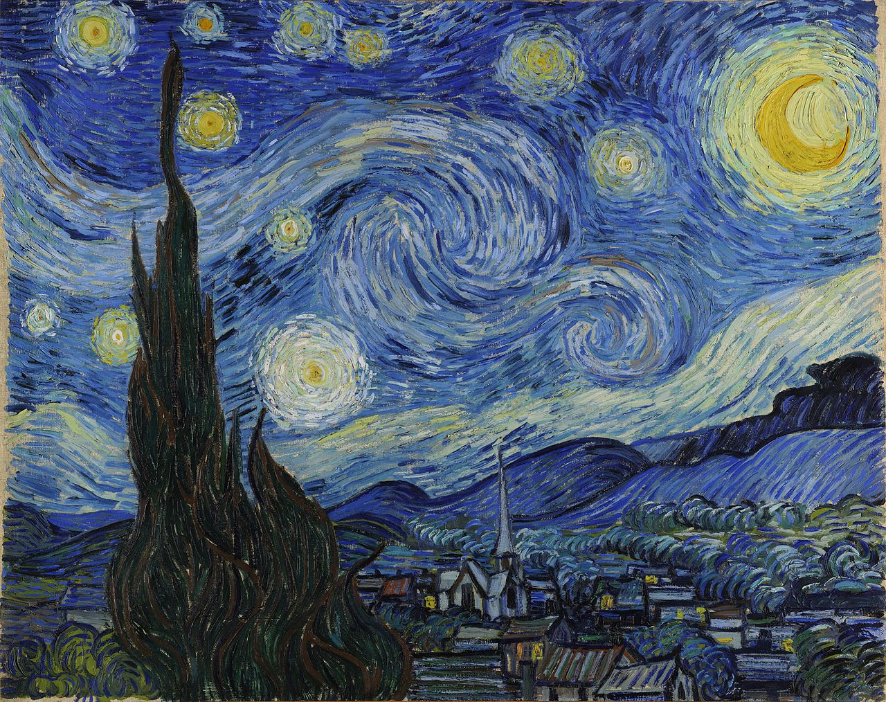
Visual rhythm refers to the "flow" of your eyes over a work of art. It is very similar to music and the way we sense a beat, but instead of our ears, we are using our eyes. Rhythm is created by the organization of elements in a way that keep the design active. It creates a “visual mood” and our eyes are excited just the same way our ears would be to music or our feet to dancing. In Starry Night, Van Gogh's heavily textured brushstrokes creates a sense of rhythm in the swirly clouds and wavy cyprus trees.
Visual rhythm refers to the "flow" of your eyes over a work of art. It is very similar to music and the way we sense a beat, but instead of our ears, we are using our eyes. Rhythm is created by the organization of elements in a way that keep the design active. It creates a “visual mood” and our eyes are excited just the same way our ears would be to music or our feet to dancing. In Starry Night, Van Gogh's heavily textured brushstrokes creates a sense of rhythm in the swirly clouds and wavy cyprus trees.
If your feet are muddy or you are walking in some loose dirt, try to twist your feet across the surface of the ground; spin in place; drag your feet. What different sorts of marks do you make? Maybe incorporate these movements into a dance... leaving marks on the ground. I'd really like to see that!!!
8. Variety:
George Seraut’s A Sunday Afternoon on the Island of La Grande Jatte (1884) is a good example of a variety of elements and principles to create a work of art in which our eyes keep wandering around...just like the people strolling by the water.
Do you have a favorite outfit to wear? Everything goes together. You even have shoes to match... Does it fit just right? Not to small or too big? Comfortable. It's your favorite color. Everyone says you look great when you wear it? It makes you feel happy?
9. Unity:
Everything just feels good! Life is good! All the elements of art are working and playing nicely together.
When an artwork creates a “sense” that all the pieces fit together, unity is achieved.

Think of cooking a big pot of soup. This soup has many ingredients (like the Elements of Art) to make it taste fabulous.
You will need to measure all of the ingredients perfectly and followed the recipe (paying attention to the Principles of Design).
All of the many ingredients are like many elements in a well done work of art.

